You've most likely seen word clouds before, like in the sidebars of various blogs, even if you didn't know what they're called. Those odd pictures with lots of words, in different sizes and colors and maybe even directions. It's a fun, easy way to present words that are related to one another, and to quickly show which ones are more significant in some way.


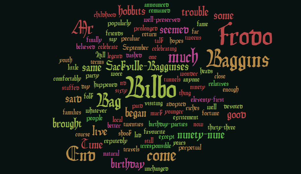
Pixabay has tons of them, and you can even create your own. The one I created below with WordItOut shows the frequency of certain words from the first chapter of Lord of the Rings, although the relative sizes of various words could just as easily represent any numerical data - popularity, frequency, importance, etc.
For example, Infogram lets you easily create a word cloud based on any set of data you give it. Using Stack Exchange Inc's annual developer survey data, I pumped two sets of data into Infogram - developer types, and years of coding experience by type.
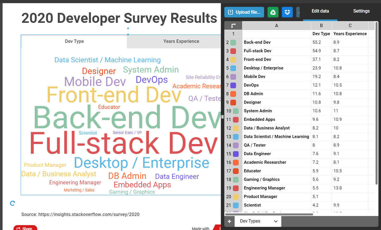
Do you notice anything just by looking at the relative sizes below, even if you didn't know the exact numbers? At the end of the day, most devs either work on the front end, back end, or both (full-stack), so naturally those are largest.
Senior execs and engineering managers report the longest coding experience, so either developers eventually move into managerial roles, or managers like to be hands-on and dabble in the codebase. Desktop devs report more experience too, as do system and db admins - makes sense, since that was the majority of work before mobile devices and web development blew up in popularity (relatively recently).
In general, word clouds set the most significant word(s) in the center, right in front of your eyes. As words become less significant, they're placed further to the outside edges, perhaps even in lighter colors or thinner fonts.
While online tools make it easy to create a word cloud, there's no reason you couldn't make one yourself in the language of your choice. You just need to be able to read in some data, then write it out to the screen in a manner that's weighted based on that data.
Here's a quick example I threw together using Python and the built-in Tkinter module for drawing to the screen. In a very rough way, the smaller the percentage gets, the more faded I make the color, and the farther I move it from the center.
import random
from tkinter import *     # use Tkinter for Python2
window = Tk()
window.title("Welcome to LikeGeeks app")
window.geometry('800x480')

mid_h = 320
mid_v = 240

results = {
    'Back-end Dev': 55.2,
    'Full-stack Dev': 54.9,
    'Front-end Dev': 37.1,
    'Desktop / Enterprise': 23.9,
    'Mobile Dev': 19.2,
    'DevOps': 12.1,
    'DB Admin': 11.6,
    'Designer': 10.8,
    'System Admin': 10.6,
    'Embedded Apps': 9.6,
    'Data / Business Analyst': 8.2,
    'Data Scientist / Machine Learning': 8.1,
    'QA / Tester': 8,
    'Data Engineer': 7.6,
    'Academic Researcher': 7.2,
    'Educator': 5.9,
    'Gaming / Graphics': 5.6,
    'Engineering Manager': 5.5,
    'Product Manager': 5.1,
    'Scientist': 4.2
}

def rnd_pos():
    return 1 if random.random() < 0.5 else -1

for dev_type, percentage in results.items():
    start_pos = int(165-(percentage*3))
    color = '#%02x%02x%02x' % (255, 50+start_pos, 50+start_pos)
    lbl = Label(window, text=dev_type, font=("Arial", int(percentage)), fg=color)
    lbl.place(x=mid_h-(start_pos*rnd_pos()), y=mid_v-(start_pos*rnd_pos()))

window.mainloop()
It ain't the prettiest, but it's okay for a non-pythonista in under an hour. You could do the same in the language and framework of your choice, of course. Word clouds might not be the best representation of data at your next work meeting, but in the right (casual) setting it might be a good way to make sure someone's focus goes right to whatever's most important... however you happen to define that!


Feel free to share a snapshot or link to your own word cloud in the comments below. Good luck. Have fun! 🙂