
I recently stumbled (after dialing into CompuServe with my 2400 baud modem of course) onto a blog post titled Designing Windows 95’s User Interface, where the author posted the contents of an article by Kent Sullivan from the 1996 Conference on Human Factors in Computing Systems. It's worth a read, especially if you write/design software and used Windows 3.1 once upon a time.
My biggest takeaways: (the ref section is in italics)
- Discovering the benefits of Agile and MVP (Design Process)
- Using prototypes and code as a "living" spec (UI Specification Process Evolution),
- Many of their UI choices are still in Windows (Rapid Iteration Examples),
- Realizing that "not getting it right (the first time) was as useful and interesting to creating a product as getting it right was." (Conclusions)
And, completely unrelated to that article, you can now relive the glory days of Windows 95 thanks to Felix Rieseberg! 🎉

As it turns out, there were a number of interesting articles, which seemed to have disappeared except for archived versions in the Wayback Machine. So I thought I'd post one of them for posterity.
Briefly, it's about how Merrill Lynch, back in the 90s, went from a gargantuan text-driven app that only a vim user could love, to something that wasn't (as they put it) a "usability nightmare". To do it, they seemed to have been given a wide leeway for creating and testing designs, getting feedback, and iterating quickly. The shell they were replacing was essentially the text version of this:

It's interesting to read about their first iterations, where they ended up with multiple groupings of tabs that in theory put all the useful info at the users' fingertips, and yet it wasn't very intuitive either. And what they ended up with.. well, I'll let you read it. But I've gotta say it's impressive how polished it looks for over 20 years old, and how their "bookshelf" metaphor lives on in many desktop apps even today. It says something about designing in a way that mimics something we're already intimately familiar with.
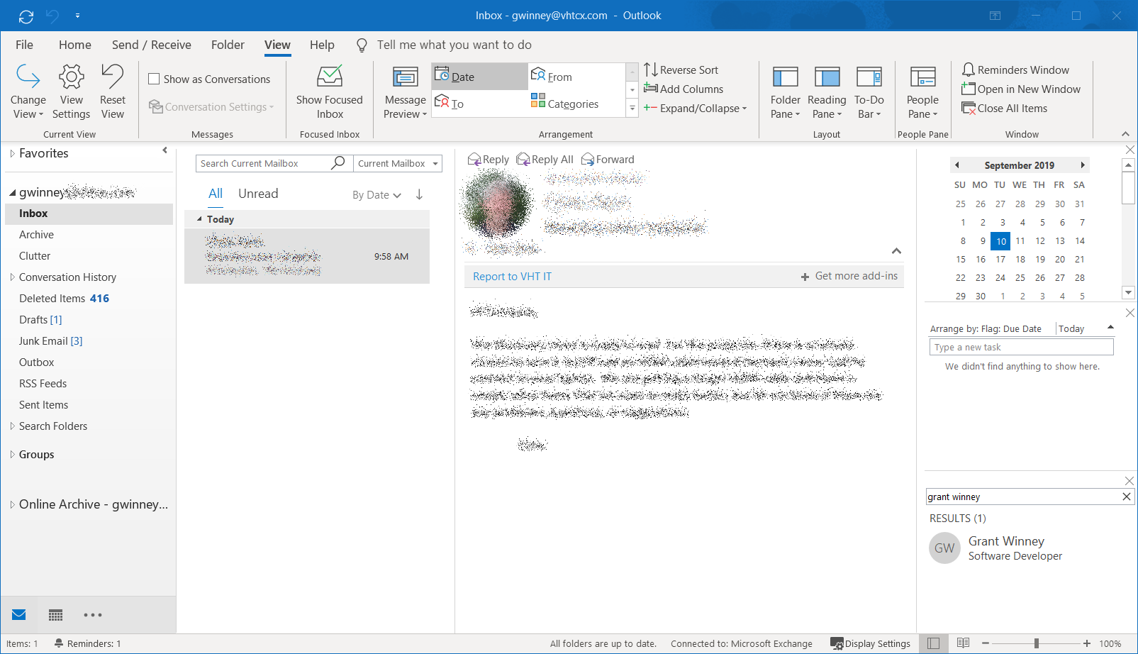
For example, in Outlook the "books" are email and calendar, the "chapters" are categories of email, and the "pages" are individual emails. Outlook keeps things listed on the right no matter which email (page) you're turned to - things that you always want visible like upcoming events and tasks. Ironically, I really like the color scheme ML added to their app, as well as the logic behind it, something Microsoft is moving away from that has really harmed usability. Granted, ML is hardly the only influence, but everything in the past has led to the present, and I'm sure they influenced their share of designers and programmers...
Without further ado...
Real World Design in the Corporate Environment: Designing an Interface for the Technically Challenged
Susan Hopper
Merrill Lynch
User Interface Design
400 College Road East
Princeton, NJ 08540
(609) 282-4793
email:Susan_Hopper@ml.com
Harold Hambrose
Electronic Ink
President
401 S. Second Street Suite 304
Philadelphia, PA
email:Harold_Hambrose@ml.com
Paul Kanevsky
Merrill Lynch
Strategic Market Systems
400 College Road East
Princeton, NJ 08540
(609) 282-5747
email:Paul_Kanevsky@ml.com
Abstract
The development of a graphical user interface for Merrill Lynch's Trusted Global Advisor (TGA) system is a major endeavor to bring enhanced information access and updated technology to the desktops of more than 15,000 financial consultants and industry professionals firmwide.
The TGA development team's goals and challenges are two-fold. The business goal is to create a comprehensive, integrated computing environment that is unique and would identify Merrill Lynch as the technology pioneer in the financial services industry.
The technological challenge included the design of a graphical user interface that could be easily learned and understood by all users in the Firm-the majority of which are PC illiterate. In order to have acceptance from the users, this new system has to appeal to both the first-time GUI user and mouse aficionados alike.
Keywords
user interface, corporate environment, hierarchy, tab metaphor, iterative design, book, shell.
Introduction
The system being replaced is a 3270, character-based mainframe system. The current network is a usability nightmare, but contains an enormous amount of valuable information that has to be maintained and transferred to the new system. In addition, the old system forces the user to know three-letter function codes (more than 300 in all) for any task they wants to accomplish.

The new platform design is utilizing the Microsoft Windows NT operating system running under a graphical user interface in a TCP/IP networking environment. The interface has to allow users to easily accomplish tasks in a minimal amount of time.
The challenge here is to make the technology as transparent to the user as possible. The team's directive: the user should only be concerned with what they need to do; how to do it on the new system should be obvious.
The team's challenges to date:
- How do you design a comprehensive system that seamlessly integrates 350 separate applications into one easy to learn and use business tool?
- How do you design an interface simple enough for even the most inexperienced of users, NONE of whom can afford to lose even one day of business for training?
- How do you introduce user interface design and usability concepts to a huge development community and make these processes work in an area traditionally resistant to change?
I - The Shell: A History of the Design
When this project was originally started in 1993, there were many prototype iterations and opinions of what the "the Shell" should look like and how users would be expected to interact with it. Multiple shell designs were produced, none of which seemed to work. Accurate evaluations of unsuccessful iterations didn't take place, as qualified Human Factors Engineers and User Interface Designers were not involved in the project. The team seemed to be designing in a vacuum-allowing only a select (and often unqualified) few to critique the design.
Eventually, the team was reorganized to include professionals who had already created a very successful shell-based design in another area of the company. This earlier product was created for a smaller-scale system, dubbed "CICERO." The user base was familiar with Windows, and CICERO was to replace numerous off-the-shelf products that were being used to accomplish the user's tasks. No formal usability tests were done, however, informal testing provided positive feedback as to the ease-of-use of the CICERO system. With the infusion of much needed expertise and guidance, the TGA project was refocused and put on the right track.

The Shell needed to accomplish several things-it needed to be extremely powerful, in that all utilities and access to all information should be easy to find. Nothing could be buried. The time-on-task for a user was critical. This alone created a design challenge. How crowded could a 1024 x 768 screen be? We didn't want to overwhelm the user, but we wanted everything within easy reach.
The Shell design was based on the CICERO tab metaphor (shown above), whose Windows users found extremely easy to understand. Navigation to information was achieved through the use of up to three levels of tabs. The tabs were located clockwise around the application window. The primary level tabs were across the top of the space, the secondary tabs were positioned vertically on the right side of the space, and the tertiary tabs were located underneath the application window. Access to information was achieved by clicking on a top level tab, then on active secondary choices and tertiary tabs if necessary. By utilizing the tab metaphor from CICERO in the TGA shell design-segmenting the applications in a hierarchical format with which the users were familiar, we hoped to lessen the learning curve.
In addition to the application space, the TGA shell also needed to display real-time data at all times, such as stock quotes and other market information. These would be viewed in the InfoCenter, a panel located on the left-hand side of the application space. Users also indicated that they wanted to view company video broadcasts and TV news channels in the InfoCenter. A common set of functions across all applications such as print, fax, e-mail, on-line help and tutorials are also provided by the Shell via a set of buttons in an area known as the Action Bar.
II - Design Iterations
Once the CICERO model was adopted, we needed to refine it for the new user base. We created several versions, each iteration was based on a new requirement from management or users.
Initially the outgoing utilities such as print and fax were located at the top right, to keep them in view, however, we discovered through our own use that it was awkward to drag upwards, so they were moved to the lower right. Since our users need to be aware of many things at once, not all of equal importance, we developed a mechanism to alert users to incoming messages or alerts that they need to view or take action upon such as an opinion change or an incoming e-mail message. This message center consisted of buttons which appeared to have a light indicating the urgency of the alert. Red was critical, yellow was not critical but that there was a message or alert that was present, green indicated empty or no alert or message was present. We soon discovered that these colored buttons became distracting and were removed. This facility was replaced by a scrolling window which the user could configure to view only the alerts they were most concerned with.
As time passed, Shell real estate became quite valuable. The area known as the Device Bar was expanded to include Calendars, clocks, intelligent messengers and Go To and Return To controls.
Also our tastes had changed. We now preferred a flatter, sleeker look for the Shell. We maintained three-dimensionality, but lowered the height of buttons and frames-giving us a little more visual breathing room.
Behind the Screens
To achieve a truly integrated computing environment, all applications developed internally or purchased (e.g., Microsoft Office) are subordinated and controlled by the shell. In effect, they become pages in the TGA book, and cannot be accessed as "stand-alone." The uncluttered layout and shell-managed display avoids the confusion caused by the floating or overlapped applications, while experienced Windows users are not hindered in the performance of their daily tasks.
Several methods were used to achieve this goal. All applications reside within the application space in the shell. The shell manages the process of showing and hiding application screens, and does not allow any portion of an application to become obscured. Intuitive bookmarking and navigational methods are implemented to give the user the feel of continuity and integration within the shell.
To reinforce this feeling of continuity, the shell provides a context management and sharing mechanism. Using context management, the user can pick the focus of interest once for various applications. For example, a user can select John Smith as the client context, and then navigate to the client profile application. With the same client in focus, the user can then switch to the asset allocation application to see John Smith's holdings. In the background, the shell delivers all the necessary information to each application as soon as a new client is selected. The context sharing can be as simple as passing an account number, or as complex as passing multiple database records from application to application.
The bookmarking capability in the shell simplifies the interrupt-driven day of a Financial Consultant. Using the same example, while the user is viewing John Smith's information his telephone rings. It's Mike Doe and he wants to buy a stock. The user clicks on the order book and places the order. To return to the unfinished task, the user simply clicks on the Client book and his other client and his profile are presented at exactly the point he left them.
III - A Cry for Standards (or Putting the Cart Before the Horse) : The Design Team is Formed
With the Shell design firmly entrenched, we set out on our adventure to bring the Shell to the development community. True to corporate style, a committee was formed to quell the serious demand for some sort of user interface standards. We had no clear-cut objectives other than to go into seclusion and miraculously come out with UI standards for the Shell and as-yet-undeveloped applications.
The Design Team members represented the areas of technology, business, design and human factors. Each discipline was represented by at least two individuals.
After several months of brainstorming and brain-bashing, we came out with a set of half-baked, fairly useless standards. It didn't go beyond the UI guidelines already available from software manufacturers and industry experts, with a few exceptions. We created groups of controls such as the Finder, which handled context management. Although the standards reiterated what most GUI developers already knew, we recognized that a large portion of our development community had never been exposed to GUI development before (they were, until recently, COBOL mainframe programmers) and that we needed to educate them on the various controls. Although they could have read the guides, we wanted to create one comprehensive document that they could refer to for anything.
This attempt failed. Standards spoke of what a control was, but offered little assistance in how a control was to be used. All applications posed unique design challenges and the Standards document proved to be a poor cookbook for applications design. We were immediately sent back to try again by senior management. Realizing that the composition of this team was insufficient, the original team was reorganized to include new members with UI design skills and human factors experience. Still, we ran into the concern that we were putting the cart before the horse. But the demand grew and we complied. After several more weeks, a Standards document was published. It included more corporate standards to promote Merrill's look and feel such as color usage standards, fonts, spreadsheet controls, group box controls, "more detail" controls and language. It was a starting point that would assist developers in fulfilling their directive to create applications that had the same look and feel.
Even though the Design Team felt as if we were not completely comfortable with the standards we published, the exercise was not useless. We found that we needed to amend the Standards Guide or publish Updates on a relatively frequent basis. This not only aggravated the developers, but potentially pushed back their delivery dates.
When interface design began in earnest, the Standards could be amended. Now came the hard part-getting the standards to fit into the interface design of the applications-or vice versa depending on the developer or their manager.
IV - Into the Trenches
Upon general distribution of the first draft of the Design Standards and Guidelines, the Design Team re-evaluated its position in the development environment. Up to this point, the team had been a decision-making body responsible for the creation of a list of recommendations for the design of the TGA interface. The team had to now mobilize in order to affect change in an environment that had already progressed in the development effort without the benefit of interface design standards and guidelines.
In order to efficiently affect the most change within the many application groups developing end-user interfaces, the Design Team decided that it would be advantageous to divide and conquer. Sub-teams were formed from the members of the design team and assigned to various application development projects. These sub-teams consisted of four members-one member from each of the disciplines that comprised the original committee. There was a sub-team for each of the major development efforts, such as Client applications, Product applications, Research, Business Management, etc.. The design team as a whole would remain intact, but to service the development groups as smaller, more dynamic teams seemed to work best.
The sub-teams met on an as-needed basis, more in a consultative fashion at first. Usually the UI designers would venture out first to assist developers with standards questions and then UI design. Eventually an informal review of the application was scheduled with the whole sub-team. A document was to be produced to assist the developers in making any necessary changes, however, this seemed to infer a more formal approach and the document was abandoned. Verbal communication seemed to be enough. The developers also had input into the design of controls or variations in layout to accommodate any special needs that may have.
Cross Application Reviews were developed to assure that any function that may be common to other applications was being done consistently. These reviews were done by the entire Design Team. This was in addition to any formal reviews that were scheduled with the sub-teams.
The Up Side
With smaller, more accessible teams, developers were now encouraged to utilize these individuals as a resource for the definition of their user interface-not simply as a governing body bestowing a blessing (or not) on their UI design efforts. Individuals with a particular skill were now seen by developers as an aid-not a review checkpoint. Members of these smaller teams could now communicate rapidly to the whole design committee those decisions made while working with developers. Communication between the individual developers and the design team (as well as among the design team itself) was improved.
Because of the physical size of these sub-teams, members were able to sit in the developer's cubicle (their turf) to evaluate their user interfaces. This created a hands-on work session environment rather than the presentation-and-review scenario-the alternative with a large design committee. Developers no longer felt as if they were "going before the board" and interaction between them and the Design Team flourished. And since UI designers were able to assist any team (not just the sub-team to which they belonged) the sub-team's evaluations usually went more smoothly.
The Down Side
As a large committee, it was easy for individual members to leave certain areas of the guidelines and standards decision-making to others. Within smaller teams, however, it was critical for all individuals to be well versed in all design decisions documented in the Standards and Guidelines document and why they were made. It was important too, for sub-team members to support the design decisions recorded in the document, even though they may have disagreed when the decision was originally made. When members of the team responsible for a document contradict the statements recorded in the Standards document, this makes the team seem fragmented and unorganized. It is important for team members to voice disagreements and concerns about the documented guidelines and standards to the appropriate audience, but present a unified front.
Once out in the trenches in sub-teams, it was not difficult to forget the larger design committee to which we all belonged. It was critical to the survival of the Standards and Guidelines document (as well as the team), that design decisions and challenges that arose from sub-team work be communicated to other design team members. Without ties to the original team, we risked becoming as fragmented a development and design effort as the one that necessitated our creation.
It also became apparent that there weren't enough UI designers and Human Factors specialists to go around, so some applications fell through the cracks. They were discovered during formal Design Team Reviews and Cross Application Reviews. We are currently seeking to either streamline the process, or acquire more resources
V - Battle of Wills: Process, Standards and Applications Design
Since all of the applications were to run under the shell, we needed the appearance of one big, consistent application. This presented another design challenge-introducing developers to the concept of user interface designers and usability engineers. Our entire development team for this project is more than 400 people. Although developers were familiar with a process, these new extra steps caused some anxiety among the community. Standards were welcomed; however, when it came time to follow a process, (which a project of this magnitude truly needs), there were some differences of opinion as to which process to follow and what to do when. As a result, no consistent process was followed for the most part.
As in most corporate environments, time is of the essence. Since no formal UI Design step was in place in the development lifecycle, developers forged ahead in order to meet their deadlines. And there were many of them-Beta 1, 2, and 3, Pilot, Release. Applications were developed rapidly, with little regard for usability. Usability Testing, however, was a formal step in the process. Most developers would go in on their scheduled usability lab day and promptly watch their application fail. A usability report was delivered and most changes would be made. Then the developers would parade in to usability and watch their application fail again. UI Design clearly needed to be a formal step in the process and the team campaigned for this. To date, it is now part of the processp;however, the process is still being fine-tuned.
VI - A Pain in the Neck: Usability Testing Round One- an example
Now, we had our shell and some redesigned applications. We were ready to conduct our first formal Usability testing series. We brought in Financial Consultants from all over the country with different backgrounds and levels of PC experience. Our users were divided into three major groups, Administrative Assistants, Field Champions and FCSAC (Financial Consultants Systems Advisory Council).
Every user that was tested tilted their heads to the right to read the side or secondary tabs. We thought it might present a problem the first or second time through, but this problem persisted, even though the users were now familiar with the tab structure.
We assumed the problem stemmed from the readability problems associated with rotating text vertically, since some letters would blend into each other and other letters would kern apart. We tried changing the font, the size, the color, we even anti-aliased the text-still the users tilted their heads and proclaimed they couldn't read the tabs. In addition, if the users found the correct side tab (after tilting their head), they missed the tertiary tabs because they were positioned at the bottom of the application area.
Another problem was that users didn't seem to understand the tab metaphor. The tab, tab, tab metaphor seemed alien to these users, they didn't understand the hierarchical structure. We also learned that part of the problem was one of language-which would have to be addressed separately. What we thought a tab should be called was foreign to the end user. So the business partners, who act as liaison to the end users, went out to talk to the Financial Consultants and their Administrative Assistants. Paper prototyping sessions were conducted to determine what the tabs should be named and what tasks would reside under them. Finally, users were influencing their product's form.
A secondary, but nagging complaint from users was the lack of color. After using PRISM for so long, they became accustomed to looking at a bright screen with large chunks or primary colors (blue, red, yellow and gray). TGA looked "depressing" and "too gray" to them. We had made a conscious effort to keep color to a minimum simply to not distract users and to use color only if was truly meaningful not just for aesthetic reasons. An understated and unobtrusive (not to mention not-blinding) interface was our goal. But it seemed our effort went unappreciated. They screamed for bright yellows and reds, greens and blues. Clearly we needed to make a compromise. So we went back to work.
VII - Back to the Drawing Board...Again
After careful consideration of all usability issues, it was decided that we needed to take the design apart and strengthen the metaphor.
The interface was redesigned and the metaphor of a book shelf was introduced. The former four-level tab hierarchy was now organized and presented on the screen as Books, Tabs, Chapters and Pages. The main benefit of this metaphor is that it hides the complexities of managing multiple applications from the user, while presenting a uniformly logical view of the data. For a novice user, opening a book is a simple as a single mouse click on the cover of the book. Flipping pages is just as simple, with a single click on the desired tab. The hierarchical organization, its dependencies and relationships are clear to the user through this presentation on the screen. For an advanced user, the shell provides short-cut keys to reduce the number of keystrokes and mouse clicks. To aid a novice user, the shell makes all of the transitions smoother and more apparent through extensive use of animation and sound effects.
The InfoCenter was moved to the right-hand side. Though this information was important, users felt it to be secondary to their task at hand. This put focus on the application area, where most of the work is performed.

The top-level tabs were replaced by the books which were placed vertically down the left side of the application area. They were color-coded, each book a different color. The secondary tabs, colored to coordinate with the active book, was moved to the top and the tertiary tabs were replaced by a tab-like control, called chapters, which also indicated if there was a fourth-level selection by an embossed down arrow. By placing all of these navigational controls closer together, we reduced mouse and eye movement greatly. The book, tab, chapter, page metaphor was something all the users could relate to. They could touch it and understand the underlying hierarchy-thereby reducing learning curve.
We increased the use of color in this design. Because we corresponded the color of the books to the associated tabs, at just a glance, users could quickly identify which book they were working in. Additionally we added color to the application space by using colored bars for group boxes and colored triangles for detail indicators, lessening the feeling of "grayness."
Usability Testing Round 2
We started with paper prototypes, taking them to different groups within the Firm. We showed user the old design and compared various versions of the new shell. This time we got a more positive reaction. They commented that the books looked more user-friendly, they were easier on the eye-"no more tilting your head." They liked the color coding of the books and they felt the interface itself was more pleasant to look at. So we proceeded with an electronic prototype. After a few weeks of tweaking the design, it was ready for another round of testing.
Again, we got positive results. Users no longer needed to tilt their heads, it was much easier to read, and they understood the hierarchy. Tertiary selections were easily located, and fourth-level functionality seemed to present no problems.
There were still a few issues to resolve, however. Readability was still clearly an issue. Users, having been used to reading 12 point Courier in all caps, found our 9 point Arial
Where We Are Now
At the time of this writing, we are about halfway through our development effort. The shell and its applications are in the final revision stages, in preparation for the first round of Beta testing, which is looming on our calendars. Beta versions are going out in three offices (1 per month for 3 months). Then taking this feedback with us we will pilot TGA in select offices. Eventually a full rollout will commence in late 1996.
Conclusions
The ever-evolving design process on this project proved to be the biggest learning experience for most members of the team. When TGA was first conceived, this appeared to be a monumental project-one that would never see the light of a computer monitor. Seeing it take shape and was one of the most rewarding aspects of being on this project.
A few lessons learned ingrained in all future process: Prototypes come in all shapes and sizes. When you're still trying out concepts, use prototypes that don't require code. Use paper or multimedia tools to demonstrate your concepts.
We found that the shell was the furthest along in its development cycle (even though it had the fewest business requirements) because we continually prototyped with either still pictures (as in Photoshop) or scripting tools (Director). We could tweak and test until it was right, then we could build it. It doesn't have to "work" to get your ideas across. This way you can quickly mock up a conceptual model without worrying about coding, debugging and data.
Putting together a multidisciplinary Design Team was also an important factor. Once your objectives are clear, each member can contribute something valuable from their own perspective. It provides a more multidimensional design.
Recognize the iterative nature of the UI development process. Design solutions are seldom found at the start of any development project.
Another important lesson, especially in the corporate environment, is compromise. Deadlines are mightier than the standard, or usability, or UI design. Accept incremental changes. Developers want to build the best system they can and if they accept you as part of the team, there's no better partnership.
When in a team that is responsible for making decisions that affect many development areas, always defer to the person with the expertise (not the highest ranking member) when no one agrees. This is the whole point of a multidisciplanry team.
Mobilizing a larger entity such as the Design Team into the trenches can prove to gain many allies, especially if there is initial resistance to the design process. Working sessions are much more productive than being viewed as a sign-off checkpoint.
Lessons learned from the development community: to never turn away a user interface designer who wants to help. Working in a vacuum is not user-centered design, and it can be a lot of time wasted going in the wrong direction. User Interface designers and human factors specialists should get in the process as early as possible. There's nothing less productive than telling developers that "their baby is ugly" two thirds of the way into the development effort.
Acknowledgements
The work presented in this design briefing represents the collaborative work of many talented, committed and hard-working individuals, inspiring visionaries and brave leaders. These people include Ritch Gaiti,Andy Williams, Tony Pizi, Paul Kanevsky, the members of the Design Team: Alan Amira, Laura Flannery, Phil Gilligan, Betty Greenberg, Paul Ilechko, Pat McAleavy, Janine Purcell, Nicole Speigel, Maury Weinberg, and Christine Zafiris. Members of the development team: Ashe Vashtare, Chris Cobb, Doug Breuninger, Rob Sterlacci, Pam Smith, and numerous others who made this project possible.